
Color can totally change the vibe of any room in your home. When you find the right mix of hues, you turn a basic space into something that feels like you—a place that sets the mood you want.
Remember to repin your favorite images!
The perfect color palette either opens up a room, makes it cozier, adds a burst of energy, or brings in a sense of calm. It all depends on what you’re after.

Picking colors might look intimidating at first, but honestly, there are some combinations that almost always work. Maybe you want a peaceful bedroom with soft blues and greens. Or you’re craving a kitchen that pops with coral and mint. These easy color formulas really take the stress out of decorating.
You can pull off a jaw-dropping makeover without calling in a designer. Try a monochromatic scheme—different shades of one color—or go for seasonal palettes that bring spring freshness or autumn warmth. These combos fit any room, big or small.
Change up your colors and you’ll notice the difference right away. It’s one of the cheapest and fastest ways to make your home feel new.
The Power of Foolproof Color Palettes

Color choices either make a room shine or totally miss the mark. The right color palette transforms your space, sets the mood, and shows off your personality.
Why Color Selection Matters
Color isn’t just for looks—it’s a powerful tool for shaping how you feel in a room. Some colors open up a space, others make it feel snug, and some just boost your energy.
You walk into a blue bedroom and instantly feel relaxed. A yellow kitchen? It just feels sunnier and more cheerful. Color psychology explains why these things happen—colors really do influence our emotions.
If you pick the wrong colors, a room can feel awkward or even stressful. Too many clashing shades create chaos. The right palette brings everything together and just feels right.
Transforming Your Space With Color
With a smart palette, you can give your space a whole new look—no costly renovations needed. Just painting a wall can change the energy of a room in a single afternoon.
Try these ideas:
- Feature walls: Paint one wall a bold color for instant drama.
- Color zoning: Use different colors to mark out areas in open spaces.
- Color layering: Mix lighter and darker shades of the same color for depth.
Small rooms love lighter colors—they make everything feel airy. If you’ve got a bigger space, dark colors add coziness and drama. Even swapping out throw pillows or art can totally shift the mood.
Defining Foolproof Color Palettes
Foolproof palettes bring together colors that just work—no design degree needed. You get harmony without the risk of mismatched chaos.
Some winning formulas:
- Monochromatic schemes: Stick with one color, just play with its shades. It’s simple and always looks polished.
- Complementary colors: Pick colors opposite each other on the wheel (like blue and orange) for a lively, balanced vibe.
- Analogous palettes: Choose colors next to each other (like blue, teal, and green). They naturally blend and feel easy on the eyes.
Nature offers great inspiration—think of beachy sand and sky blue, or a forest’s greens and browns. These combos just make sense.
Fundamentals of Color Theory

Before you dive into picking colors, it helps to know a bit about color theory. This stuff gives you the basics for mixing and matching colors that actually go together.
Understanding the Color Wheel
The color wheel is your go-to tool for picking colors that don’t clash. It’s a circle that shows how all the colors relate.
You’ll usually see 12 colors on the wheel. Red, yellow, and blue are the primary colors—they’re the base. Mix two of those, you get secondary colors like orange, green, and purple. Then you have the in-between shades, called tertiary colors.
If you want a calm, put-together look, pick colors that sit next to each other (analogous). For something bold and energetic, go for colors opposite each other (complementary).
Primary and Complementary Colors
Red, yellow, and blue are the big three—you can’t make them by mixing anything else. They’re the foundation for all the other colors.
Complementary colors live on opposite sides of the wheel:
- Blue and orange
- Red and green
- Yellow and purple
When you pair these, you get a punchy contrast that grabs attention. If you want something a bit softer, use the “split complementary” trick. Pick one color, then use the two shades next to its opposite.
Try the three-color rule: let your main color cover about 60% of the room, a secondary color for 30%, and an accent for 10%. It keeps things balanced but interesting.
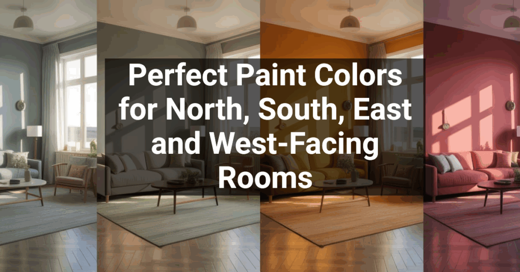
Warm Versus Cool Colors
Colors actually change how a room feels. Warm tones (reds, oranges, yellows) bring energy and make spaces feel inviting.
If you want your living room or kitchen to feel cozy and lively, go with warm colors. They seem to come forward, so they’re great for making big rooms feel more intimate.
Cool colors (blues, greens, purples) chill things out. They’re perfect for bedrooms and bathrooms—anywhere you want peace and quiet.
Cool tones make small rooms feel bigger, especially if there’s lots of sunlight. When you mix warm and cool colors, you get balance. If you stick to mostly one or the other, you create a strong mood.
Types of Foolproof Color Schemes

Color schemes set the whole personality of a room. The right mix can turn a blah space into something you actually want to hang out in.
Monochromatic Palettes
Monochromatic schemes use one color in different shades. It’s clean, simple, and tough to mess up. Just pick a color you love, then use lighter and darker versions.
Picture a blue monochromatic room:
- Navy blue on an accent chair
- Medium blue on the walls
- Soft blue on the ceiling or trim
This works especially well in smaller spaces. You get harmony without it feeling too busy.
To keep things interesting, mix in textures. Maybe you add velvet pillows, glass vases, or woven throws. The room stays unified but doesn’t get boring.
Analogous Color Combinations
Analogous schemes use colors right next to each other on the wheel. Think yellow-green, yellow, and yellow-orange. These combos feel familiar because we see them in nature all the time.
They’re awesome for living rooms and bedrooms where you want a relaxing, cohesive vibe. The colors just flow together.
Try combos like:
- Blue, blue-green, green (think water and leaves)
- Red, red-orange, orange (for warmth and energy)
- Purple, blue-purple, blue (super chill for bedrooms)
Pick one main color, one to support it, and a third as a little accent. That keeps things balanced. Toss in some neutrals—like white trim or natural wood—so it doesn’t get overwhelming.
Contrasting and Bold Color Schemes
Contrasting color schemes add a jolt of energy. Complementary colors (opposite each other) like blue and orange or purple and yellow make a space pop.
If you want something bold but not wild, go with a split-complementary scheme. Choose a color, then use the two shades next to its opposite. It’s lively but a little more forgiving.
Keep it under control:
- Stick to three or four colors, max
- Use the brightest shades on accents like pillows or art
- Balance them out with neutrals
The 60-30-10 rule still works here. Main color on most of the space, secondary on furniture, and the boldest color for little pops.
This approach really shines in places like dining rooms or home offices where you want some spark.
Essential Elements of Color Palettes

A great color palette comes down to how you mix colors, textures, and finishes. Get these right and you can totally change how a room feels and works.
Choosing the Perfect Hues
Pick a dominant color first—it sets the mood. Let it cover about 60% of your room. Blues and greens calm things down. Reds and oranges bring energy.
Then add accent colors that play well with your main shade. Let those cover about 30%. Use the color wheel to find complements (opposites) for punch, or analogous (neighbors) for harmony.
Fill in the last 10% with neutrals like white, black, or gray. These keep the palette grounded and give your eyes a break. Don’t skip them—they’re what make everything else work.
Incorporating Finishes and Textures
Paint finishes change how colors look. Matte finishes soak up light and hide wall flaws. Eggshell has a gentle sheen and fits most spaces.
Satin and semi-gloss bounce light around, making colors look brighter. They’re great for kitchens, bathrooms, and trim since they’re easy to clean.
Textures add another layer. Mix in fabrics, wood, or stone alongside your paint colors. A deep blue wall feels totally different next to natural wood or plush velvet.
Try layering textures in the same color family. It adds depth but keeps things simple, especially in monochromatic rooms.
Metallic and Saturated Accents
Metallics are like magic neutrals—they add class to any palette. Gold warms up cool colors. Silver and chrome give modern palettes a crisp edge.
Use metallics for things like picture frames, lighting, or hardware. Even a little bit can upgrade the whole room.
Saturated colors (those super bold shades) work best in small hits. Try them on pillows, art, or one standout chair.
Balance those strong colors with plenty of neutrals. A vivid emerald chair looks amazing against calm walls, but if you add too many bold colors, it gets overwhelming fast.
Room-By-Room Color Palette Inspiration

Every room in your home has its own job, so it deserves a color palette that fits. The right colors transform your spaces—whether you’re chilling out, hosting friends, working, or getting some sleep.
Living Rooms: Cozy and Inviting Atmospheres
Living rooms really come alive with color schemes that make guests feel at home. I find that neutral foundations do wonders in these spaces.
Timeless Neutral Base Options:
- Warm beiges and taupes
- Soft grays
- Crisp whites
These colors create backgrounds that can easily shift as your tastes or the seasons change. I like adding accent colors with pillows, throws, and artwork for extra depth.
If you want a sophisticated vibe, try navy blue with soft white. This classic duo brings in elegance but keeps things bright. The contrast grabs attention but doesn’t feel overwhelming.
For those who lean warmer, terra cotta or rust accents look fantastic against neutral walls. Earthy tones like these make the space feel grounded, especially with wood or rattan.
Kitchens and Dining Areas: Energizing Spaces
Kitchens and dining areas come to life with colors that spark appetite and conversation. I think these rooms should feel lively but still comfortable.
Kitchen Color Combinations:
| Base Color | Accent Color | Effect |
|---|---|---|
| White | Red | Energetic, classic |
| Gray | Yellow | Modern, cheerful |
| Blue | Wood tones | Coastal, relaxed |
In dining areas, I like colors that make food look even better. Soft greens and blues set a calm mood for long meals. Warmer shades like coral or buttery yellow invite people to linger and chat.
Cabinet colors can completely change a kitchen’s mood. White cabinets always look clean, but don’t shy away from color. Sage green on the lowers with white uppers strikes a nice balance and adds interest.
Lighting changes how paint looks, so always test samples under both daylight and your evening bulbs before making a final choice.
Bedrooms: Calming and Restorative Palettes
Bedrooms need to feel restful above all else. Color really shapes that atmosphere.
Soft blues and greens remind us of nature and can even lower blood pressure. These cool shades tell your brain it’s time to slow down. I like pairing them with warm wood for a cozy balance.
Lavender and pale purple offer gentle color and calm vibes. These shades work with both gray and beige accents, so you can mix things up.
If you want more warmth, try:
- Soft terracotta
- Dusty pink
- Warm sand colors
These hues wrap the room in comfort but don’t jolt you awake.
I’d avoid super-bright, saturated colors here. If you love bold shades, use them in small doses—maybe a pillow or a lamp, but not the whole wall.
Home Offices and Sunrooms: Productive Environments
Spaces for work or daytime activities need colors that help you focus and stay creative, but without tiring your eyes.
Best Home Office Colors:
- Soft green (helps with concentration)
- Blue-gray (keeps you calm but alert)
- Warm neutral with pops of color (works for lots of needs)
In a home office, think about how color affects your mood. Blue can boost productivity, while yellow sparks creativity. Pick what suits your work style.
Sunrooms soak up natural light, so try colors that look great as the sun moves. Soft greens blur the line between indoors and out. Pale yellow keeps things cheerful, even when it’s gray outside.
Skip super-dark colors in these rooms—they can feel heavy after a while. If you love dark shades, use them for an accent wall or in your furniture.
Since these spaces often multitask, pick color schemes that shift easily from work mode to downtime.
Timeless and Trending Color Palette Ideas

Color palettes really set the mood. Some combos never go out of style, while others capture what’s hot right now. The trick is finding colors that play well together and give your space depth and personality.
Warm Neutrals and Earthy Tones
Neutral palettes are the backbone of classic interior design. Creamy whites, soft tans, and sandy browns create spaces that always feel fresh and flexible.
Pair taupe walls with ivory trim and cognac leather accents for a look that’s both cozy and refined. This combo brings warmth without being too much.
For a modern feel, layer different shades of the same neutral. A greige wall with lighter greige trim and darker greige accents adds quiet depth.
Earthy colors like terracotta, olive green, and burnished gold give neutrals more character. These shades connect your space to the outdoors and feel grounded.
Classic Warm Neutral Palette:
• Base: Soft cream or off-white
• Main: Warm taupe or greige
• Accent: Cognac, terracotta, or olive
Cool Blues and Greens
Blues and greens create calm, refreshing spaces that somehow always feel right.
Navy blue works like a neutral when you pair it with crisp whites. I love this combo in bedrooms and dining rooms—it feels elegant but not stuffy.
Softer blues such as powder blue or slate blue look great with warm woods and brass. The mix keeps things from feeling chilly.
Green is still going strong for 2025. Sage green and emerald are everywhere, and they pair well with most woods.
Try layering different shades of blue-green for a fresh, unified look.
Rich Jewel Tones
Jewel tones bring drama and a bit of luxury to any room. These deep, rich colors make a statement, especially against neutral backdrops.
Emerald green, sapphire blue, and ruby red really pop as accents. You might add these colors with:
- A velvet chair
- Colored glass decor
- Patterned rugs or bold pillows
Keep jewel tones balanced with plenty of neutral space, or they can take over.
For 2025, I’m seeing more amethyst purple and topaz yellow—they’re unexpected but surprisingly timeless.
Lighting makes a big difference here. Jewel tones glow in natural light, but artificial lights can shift their look quite a bit.
Accent Colors and Decorative Techniques

Accent colors and decorative tricks can turn a plain room into something special. You don’t need a full renovation—just a few smart updates.
Statement Walls and Color Blocking
Color blocking is a simple way to make a big impact. The 60-30-10 rule helps: use your main color on 60% (usually the walls), a secondary color on 30% (furniture, trim), and an accent on 10% (accessories, art).
For a statement wall, pick a bold shade that fits with your palette. Navy blue looks stunning with cream or beige. Deep emerald green pairs well with wood.
Paint just one wall or even part of one for a focal point. It draws the eye and doesn’t overpower the room.
Geometric patterns add a touch of sophistication to color blocking. Painter’s tape makes it easy to get crisp lines.
Ombre Effects for Visual Interest
Ombre—where color fades from dark to light—adds movement and a bit of magic. You can use this on walls, textiles, or even furniture.
To do an ombre wall, grab three shades in the same color family. Start dark at the bottom and go lighter as you move up. It grounds the space and feels pretty natural.
If you’re new to ombre, try it on smaller stuff first. Curtains, pillows, or blankets with a color gradient can liven up a room without much risk.
Ombre’s soft blending makes rooms feel relaxed, so it’s perfect for bedrooms or bathrooms.
Layering Soft Sage Green, Sky Blue, and Warm Gold
This color combo always feels fresh and a bit outdoorsy, but still refined. Soft sage green is a great base and plays nicely with sky blue and warm gold.
Use sage on big surfaces like walls or sofas. Bring in sky blue with chairs, pillows, or art. Warm gold works well in lamps, frames, or small decor.
You can use this palette in so many styles—coastal, farmhouse, you name it. It just works.
Play with different shades for more depth. Deep sage with pale blue is dramatic, while lighter shades feel breezy.
Mix in patterns that use these colors. Florals, geometrics, or stripes can all work together if you keep the palette consistent.
Enhancing Specific Spaces With Color

Every room has its own vibe, and your color choices should match how you use the space. The right colors can totally change how a room feels.
Playrooms and Creative Corners
Playrooms need colors that inspire kids but don’t overwhelm them. Go for vibrant, happy shades but keep things balanced.
Primary colors (red, blue, yellow) work if you soften them a bit. Try sky blue walls with sunshine yellow accents and white furniture for a cheerful, creative space.
Some playroom color strategies I like:
- Use color blocking for activity zones
- Paint a wall with chalkboard paint for art time
- Bring in pastels for calm during quiet play
- Try removable decals for easy updates
Playrooms change as kids grow, so pick a base color that can stick around. Then, swap out accessories and art as their interests shift.
Small Spaces: Deep Navy, Soft Gray, and Warm Tan
Small rooms get a boost from the right colors. Deep navy, soft gray, and warm tan make the space feel bigger and more refined.
Paint the biggest wall navy to anchor the room. It pulls the eye forward, making the space seem larger. Use soft gray on the other walls to keep things light.
Add warm tan with:
- Wood furniture
- Woven baskets
- Cozy throw pillows
- Natural rugs like jute or sisal
This combo works in bathrooms, home offices, or tight hallways. The contrast between light and dark keeps things interesting but not crowded.
Highlighting With Rich Plum
Rich plum brings a touch of drama and luxury to a room. It’s surprisingly versatile—use it as a bold accent or a subtle detail.
In a dining room, paint the ceiling plum for a cozy, intimate vibe. It draws the eye up and makes the space feel unique.
Other ways to use plum:
- Accent wall behind a neutral sofa
- Plum drapes against pale walls
- Furniture pieces in different plum shades
Pair plum with gold or brass for a classic look. If you want something more modern, mix it with gray and black.
Entryways look amazing with plum, too. It gives guests a memorable first impression.
Tips for Achieving a Balanced Color Palette

Creating a balanced color palette is really about harmony. When colors work together, the room feels intentional and inviting, not chaotic or boring.
Mixing Tones and Textures
Pick colors that actually work together instead of clashing. I usually follow the 60-30-10 rule—let your main color cover about 60% of the space, then a secondary color takes 30%, and a bold accent gets the last 10%.
Play around with adding black or white to your colors to get different tints and shades. This trick brings in some depth, and you won’t end up with a rainbow of random colors.
You can balance warm and cool tones for a space that feels lively. Got blue walls that seem chilly? Toss in warm wooden furniture or maybe some amber accessories to cozy things up.
If you’re sticking with a limited palette, textures are your friend. Even a monochrome room can feel fresh if you mix glossy, matte, rough, and smooth surfaces. Light hits each one differently, which keeps things interesting.
Think about what’s already in your space that you can’t just swap out. The floor tone, cabinet color, or any fixtures you’re stuck with should definitely guide your palette.
Layering for Depth and Dimension
Start your palette with neutral base colors on big surfaces like walls and floors. That way, you’ve got a calm foundation that won’t make the room feel crowded.
Bring in mid-tone colors with furniture or larger accessories. These items help ground the room and add some visual weight, but they don’t take over.
Toss in small pops of bold accent colors using things like pillows, artwork, or quirky little objects. You’ll notice how these details grab attention and create fun focal points.
Think about your lighting when you pick colors. Natural daylight shows colors honestly, but artificial lighting? It can totally change the vibe, sometimes in weird ways.
Try out color samples right in your space before you make any big decisions. The color wheel can help too; if you want energy, go for complementary colors (they’re opposites). Prefer calm? Analogous colors—those sitting side by side—feel a lot more relaxed.