
Making a beautiful home isn’t just about collecting pretty things. You need both style and practicality. After twenty years in home design, I’ve watched a lot of people wrestle with getting this right.
Remember to repin your favorite images!

A well-designed space blends creativity and functionality, so your home feels beautiful and livable. When these qualities come together, your space doesn’t just look good in photos—it actually makes your daily life better.
The best home designs solve problems and give you that little lift when you walk in the door.
Finding this balance isn’t some mysterious magic; it’s a skill you can pick up. Designers have a bunch of tricks for making spaces both useful and gorgeous. These “secrets” mean understanding how people really use rooms, picking materials that last, and knowing when to go bold and when to stay practical.
Understanding the Balance Between Creativity and Functionality

That sweet spot between creative flair and practical function sits right at the core of good design. When creativity and function work together, you get spaces that look great and actually fit your life.
Defining Creativity and Functionality
Creativity in design covers all the things that make a room feel special and eye-catching. Think color palettes, quirky materials, artistic details, or a layout that just feels fresh. Creative design grabs your attention and stirs up a feeling.
Functionality is the other side of the coin. It’s about how well a space works for what you need. A functional kitchen makes cooking easy. A good living room fits your family’s routines. Functionality means thinking about:
- How you move through a space
- Where to put your stuff
- Comfort and ergonomics
- How long the materials last
- How easy it is to clean
The best spaces don’t trade one for the other. They let beauty and practicality work together.
Why Achieving Balance Matters in Design
A balanced design feels beautiful and livable. If creativity takes over and you forget about function, you’ll end up with rooms that look amazing but drive you crazy. If you only focus on function, the space might feel cold and uninspired.
Getting it right affects your life every day. Studies even show that harmonious spaces lower stress and help you get more done.
Your home should:
- Show off your personal style
- Support your day-to-day needs
- Tackle practical problems in creative ways
- Feel comfortable and inviting
- Last for years
The best rooms make you say, “Wow, this is beautiful!” and “This just works!” at the same time.
Common Challenges Designers Face
Finding the right balance isn’t simple. Designers run into a bunch of challenges when they try to blend creativity and function.
Budget constraints mean you have to make tough choices. Should you buy that jaw-dropping light fixture, or invest in storage solutions? The trick is to spot where you can get both impact and usefulness.
Space limitations force you to get creative. In smaller homes, multi-purpose furniture and clever storage save the day. Maybe a bench hides shoes and looks good too.
Competing priorities can make decisions tricky. One person wants a showstopper kitchen, another just wants efficient cooking.
Changing needs over time mean you can’t just design for today. Smart designers build in flexibility so your space can adapt.
Core Design Principles for Balanced Outcomes

Getting creativity and functionality to play nicely together means leaning on tried-and-true design principles. These help you make spaces that actually work and look good.
Prioritizing User Needs
Start by figuring out who’ll use the space and how. List the main activities for each area.
In the kitchen, think about how many people cook at once and what kinds of meals you make. This shapes things like counter height and storage.
Jot down your daily routines and what’s not working in your current setup. This list guides your design.
User testing isn’t just for tech. Ask friends to try out your space plans. Their feedback will show you what you missed.
Applying Aesthetics and Usability
Beauty and function should work together. The best designs blend both without making you choose.
Think about traffic flow when placing furniture. Leave 30-36 inches for walkways, and arrange seating for easy conversation. These choices help your space feel open and comfortable.
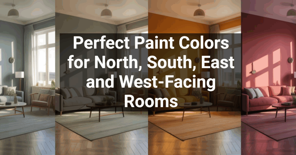
Color impacts mood and function. Lighter colors make small rooms feel roomier. Contrasts can highlight different zones and help with accessibility.
Pick materials that look good but also last. Marble is gorgeous, but if you cook a lot, quartz might be a smarter pick.
Lighting does double duty: it shows off your style and helps you see what you’re doing. Mix ambient, task, and accent lights for a space that’s both practical and appealing.
Ensuring Simplicity and Clarity
Clutter makes rooms feel stressful. A good design uses organization and clear visual cues to show what belongs where.
Let empty space do its thing. Blank areas give your eyes a break and let standout pieces shine. One big piece of art can say more than a crowded wall.
Keep a consistent look across your home. Use similar materials, colors that go together, and repeat shapes for a sense of unity.
Guide people through your home naturally. Clear sightlines and logical room layouts help guests find their way without asking.
Incorporating Practicality and Innovation
The best spaces mix classic solutions with new ideas. Don’t innovate just to be different—make sure it actually helps.
Try modular furniture that changes with your needs. A dining table that expands for guests but stays small day-to-day is a smart move.
Smart home tech should make life easier, not more complicated. Automated lighting that adjusts with the sun saves energy and sets the mood.
Repurpose traditional items in new ways. Maybe you turn a vintage door into a table or use industrial shelves for a modern vibe. These touches add character and solve storage issues.
Test bold ideas in small doses first. Paint the powder room a wild color before you commit to the whole living room.
Crafting Intuitive and Effective User Experiences

Designs that people love do more than just look good. They balance visual appeal with easy, intuitive use.
User Experience (UX) Fundamentals
User experience is about how folks feel when they use your design. Good UX starts with knowing your users and what they want.
Dig into research. Learn about your users before you start sketching. What do they want? What’s in their way? Try surveys, interviews, and hands-on testing.
Keep things simple. Nobody wants to work hard to figure out a design. Cut out the extras and focus on what matters.
Consistency helps people relax. Stick with familiar buttons, colors, and layouts so users know what to expect.
Don’t forget accessibility. Make sure people with different abilities can use your design. Use good contrast, readable text, and alt text for images.
Intuitive Navigation Strategies
People need to find what they want fast. Navigation is basically your design’s map.
Give your content a clear structure. Organize things in a way that makes sense to your users, not just to you. Group related items and set up a simple hierarchy.
Stick with patterns people already know. Menus, tabs, and buttons are familiar for a reason. Only change them if you’ve got a really good reason.
Visual cues are your friends:
- Use color for important actions
- Pick icons that make sense
- Add white space to separate sections
- Label buttons and links clearly
Test your navigation with real people. Watch where they get stuck, and fix those spots.
Creating Emotional Connection
When a design makes you feel something, it sticks with you. That emotional spark builds loyalty.
Visuals matter a lot. Colors, images, and fonts all send signals about your brand. Warm colors like red and orange feel energetic, while blues and greens calm things down.
Tell your story. Don’t just list features—share why your product or service exists. Real stories and testimonials help.
Add little surprises. A fun animation, a helpful tip, or a personal touch can turn a good experience into a memorable one.
Give users the info they need at the right time. If you show it too early or too late, it loses its impact.
Design Processes That Enhance Creativity and Functionality

Good design comes from mixing creativity with practical steps. The right process helps you balance both, so you get spaces that are fresh and actually work.
Design Thinking and Experimentation
Start with understanding your needs. Watch how people use the space and notice what’s not working. Ask yourself, “What’s the real problem here?”
Try different ideas before you settle. Rearrange furniture on paper, or mark out layouts with tape on the floor. It costs nothing and can save you from expensive mistakes.
Break the rules—just do it on purpose. Maybe the kitchen island works better at an angle, or the dining room doubles as a home office. Keep a notebook for random ideas that pop up.
Mood boards help too. Collect fabric samples, paint chips, and magazine clippings. This keeps your creative vision focused while you solve practical issues.
Prototyping and User Testing
Prototypes turn your ideas into something you can actually test. For homes, this could mean making cardboard models of custom furniture or taping out built-ins on the wall.
Digital tools can make this easy. Apps like SketchUp or Planner 5D let you try out layouts in 3D before moving a single thing.
Test your ideas by living with them for a bit:
- Rent furniture before buying
- Try temporary wallpaper before going all-in
- Use cheap fabric to mock up curtains
Think about your daily routines. Does the coffee table always get bumped? Is the reading nook comfy for more than five minutes? Real-life use will show you what works.
Iterate and Refine Approaches
Don’t expect to nail it on the first try. Make small tweaks as you go. Designers usually try a bunch of versions before settling on the final look.
Start with the big stuff. If your kitchen workflow is clunky, even the prettiest cabinets won’t fix it. Focus on flow, then polish the details.
Ask everyone who uses the space for feedback. Your teen might need more charging spots, while your partner notices storage you missed.
Stay flexible. Maybe that dramatic light fixture hangs too low, or the minimalist sofa just isn’t comfy for movie night.
Keep track of your changes. Snap before-and-after photos to see your progress. This helps you learn and improve next time.
Aesthetics, Visual Hierarchy, and Brand Identity

All the visual pieces of design—color, type, layout—work together to make things beautiful and meaningful. When you combine them well, you guide people through your content and reinforce your brand’s values.
Typography and Visual Appeal
Typography does more than show words on a page—it sets the tone and personality of your design. Pick fonts that fit your message: maybe a serif for that classic vibe, or a sans-serif if you want something fresh and modern.
Stick to just 2 or 3 font families per project. That way, things stay consistent without getting messy.
Color theory really shapes how people feel about your design. Blues tend to build trust, reds crank up urgency, and greens feel like growth. Honestly, a solid color scheme can boost user engagement by up to 35%. That’s nothing to sneeze at.
White space, or negative space, isn’t just blank nothingness. You use it to give elements room to breathe, which makes everything easier to read. It also helps guide the eye to what matters most.
Establishing Brand Identity
Brand identity goes way beyond a logo. It’s about your values, your vibe, and the promise you make to customers. The visuals you choose should reflect all of that.
Keep things consistent everywhere. Style guides help you stick to the same colors, fonts, and images across your website, social media, and print. That repetition? It’s how people remember you.
The most unforgettable brands nail their visual language. Apple’s minimalist look or Coca-Cola’s iconic red—those details become shorthand for what the brand stands for.
Think about who you’re trying to reach. Different groups respond to different colors and styles. What grabs Gen Z might totally miss with Boomers.
Trends in Graphic and Web Design
What’s trending now:
- Minimalism with bold, attention-grabbing type
- Micro-interactions that react to what users do
- Custom illustrations instead of generic stock photos
- Dark mode for less eye strain
Designers now focus more on user experience, not just looks. If your website is gorgeous but slow or confusing, people will leave in seconds.
Responsive design isn’t optional anymore. Your visuals need to look good and work well on everything—phones, tablets, desktops. More than half of web traffic is mobile these days.
Trends are fun, but they come and go. Build your designs on strong, timeless basics like clear hierarchy, readability, and brand consistency. Add in trends where they make sense for your audience.
Functional Design and Performance Considerations

Functional design puts people first and makes sure everything works smoothly. The best designs find a balance between beauty and real-world performance.
Ensuring Responsiveness and Adaptability
Responsive design means your work adapts to different screens and devices. Whether it’s a phone, tablet, or computer, it should look good and work as expected. And honestly, even home spaces need to flex for different needs.
Picture how people will actually use your design. If a kitchen island is too tall, it’s a pain. If a button on your website is tiny, users get frustrated.
Make your design adaptable by:
- Using flexible layouts that fit various situations
- Keeping navigation clear across all formats
- Ensuring content stays accessible on any device
Test how your design holds up when things get busy or users have different needs. Adaptable designs tend to last longer and stay useful.
Optimizing for Performance
Performance optimization is about making things run efficiently. If your website lags, people bail. In a house, bad layouts waste energy and make life harder.
For websites, compress images and trim unnecessary code. In home design, pick materials and layouts that save energy and make movement easy.
Performance tips:
- Cut out anything that slows things down
- Test under different conditions
- Track load times and how people interact
Watch how users really use your design. Do they click where you expect? Do they move through spaces smoothly? Good performance builds trust.
Check your design’s performance regularly. Update things that don’t work. Sometimes, small tweaks make a huge difference in satisfaction.
SEO Best Practices in Design
SEO helps people actually find your stuff. Good design supports SEO by organizing things well and making content easy to understand.
Write clear titles and headings that say exactly what’s there. Sprinkle in keywords naturally. Organize info so people and search engines both get it.
SEO-friendly design includes:
- Fast-loading pages with optimized images
- Layouts that work on any device
- Clear heading structure
Make sure your content is actually helpful. Search engines reward useful, well-organized info. Quality matters way more than tricks.
SEO is always changing, so keep learning. But at the end of the day, if you solve real problems for users, search engines will notice.
Minimalism, Clarity, and Complex Designs

Designers know that finding the right mix between simple and complex is what makes a space or site work. Your goals—and the mood you want—should guide your choices.
Minimalist Design for Usability
Minimalism is all about essentials. You cut out the clutter and focus on what matters. The result? Calm, easy-to-use spaces that don’t wear you out.
Minimalism in 2025 isn’t just sterile white walls. Now, it’s more about:
- Warm neutrals over harsh whites
- Natural materials that add interest without mess
- Purposeful negative space that lets your eyes relax
The magic of minimalism is clarity. With less visual noise, the important stuff pops. Imagine a single work of art on a bare wall—it just grabs you.
Minimalist spaces ease stress because your brain isn’t busy sorting through a ton of stuff. You can actually relax.
Managing Complexity Effectively
Complex designs can tell a story and add layers of meaning. The trick is to keep things organized so it feels intentional, not chaotic.
How to handle complexity:
- Build a visual hierarchy—let some things stand out, let others fade back
- Repeat colors or shapes to tie things together
- Set up zones for different activities
Complexity works best when you use some rules. Maybe you mix patterns, but keep the colors similar. Or you group collections together so it feels organized, not messy.
Digital tools let you preview complex designs before you commit. It’s a lifesaver if you want to experiment without risk.
The best complex spaces feel interesting but still work for daily life. They show your personality but don’t get in the way.
Tools, Software, and Collaborative Strategies

Having the right tools and team setup makes a huge difference in balancing creativity with practicality. Designers today lean on specialized software, structured collaboration, and user feedback to make sure their work looks great and actually functions.
Top Design Tools and Software
In 2025, some tools have become must-haves for designers who want both creativity and efficiency. Adobe Creative Cloud is still the industry giant, with Photoshop, Illustrator, and XD all working together.
Figma is the top choice for collaborative design. You and your team can work together in real-time, and its component system keeps things consistent.
For 3D work, Blender and SketchUp Pro are go-to options. They let you create realistic visuals so clients get the full picture before anything’s built.
Essential design tools for 2025:
- Prototyping: Figma, Adobe XD, InVision
- Graphic design: Adobe Illustrator, Affinity Designer
- 3D visualization: Blender, SketchUp, Lumion
- Project management: Asana, Trello, Monday.com
Collaboration Across Teams
Collaboration isn’t just about tools—it’s about the process. Cloud platforms like Miro and MURAL give your team a virtual whiteboard to sketch out ideas.
Design systems keep big projects on track. When everyone uses the same components, you avoid confusion and keep things looking sharp.
Regular design critiques, whether online or in person, are a chance to get honest feedback. Plan these at important stages to catch problems early.
Tools like Slack, with design integrations, let you share design bits and get quick opinions. Separate channels for different project parts help keep everything organized.
Leveraging User Feedback
Start user testing early—don’t wait until the end. Tools like UserTesting and Maze let you collect feedback on prototypes before you invest in the final build.
A/B testing lets you see which design choices actually work for real people. It takes the guesswork out of your decisions.
Heat mapping tools like Hotjar show you exactly where users click or get stuck. These visuals make it easy to spot what’s working.
Ways to gather feedback:
- User interviews, in-person or remote
- Usability testing
- Interactive prototypes with built-in feedback
- Post-launch surveys
- Analytics tracking
Keep all your feedback organized. Patterns emerge, and you can focus your changes where they’ll make the biggest difference.
Innovative Solutions and Future Design Directions

Design keeps evolving as technology and user needs shift. The designers who thrive are the ones who try new tools but still stick to the basics.
Integrating Custom Illustrations
Custom illustrations bring a personal touch that stock photos just can’t. When you add hand-drawn or digital art, you make your design feel real and memorable.
Plenty of brands now use custom characters that pop up throughout their products. These little guides help users through tricky features and add personality.
Balance is important—your illustrations should help, not distract. Try these ideas:
- Use illustrations to break down complex ideas
- Keep your illustration style consistent with your brand
- Place illustrations where users might need a boost or a smile
- Don’t crowd your design with too many graphics
Custom illustration takes some investment, but it pays off in brand recognition and user happiness.
Emerging Trends in Innovative Design
AI-assisted design tools are shaking up how designers actually work. These tools help you generate initial concepts, test out different variations, and even predict how users might behave.
You can crank out more options in less time, freeing up your creative energy for what really matters—refinement.
Sustainable design? It’s not just a buzzword anymore. Designers now think about the entire lifecycle of a product, from the materials they choose to how it gets recycled at the end. Full lifecycle consideration is just part of the process.
3D elements are popping up in places where everything used to be flat. This shift adds depth and makes interactions feel more intuitive—almost like they’re borrowing from real-world physics.
Voice and gesture controls are pushing design beyond the old screen boundaries. Before long, your products might respond to a wave or a quick voice command instead of just a tap.
Adaptive interfaces are on the rise too. These designs actually learn from what people do and tweak themselves to fit each user. Sounds a bit like science fiction, but it’s happening.