When you walk into a home where the colors just click, it feels like everything fits together. Colors can tell a story that moves from room to room, making your house feel intentional instead of thrown together.
Remember to repin your favorite images!
If you create a cohesive color story throughout your home, you bring in harmony and connect your spaces—but each room still gets to keep its own vibe.
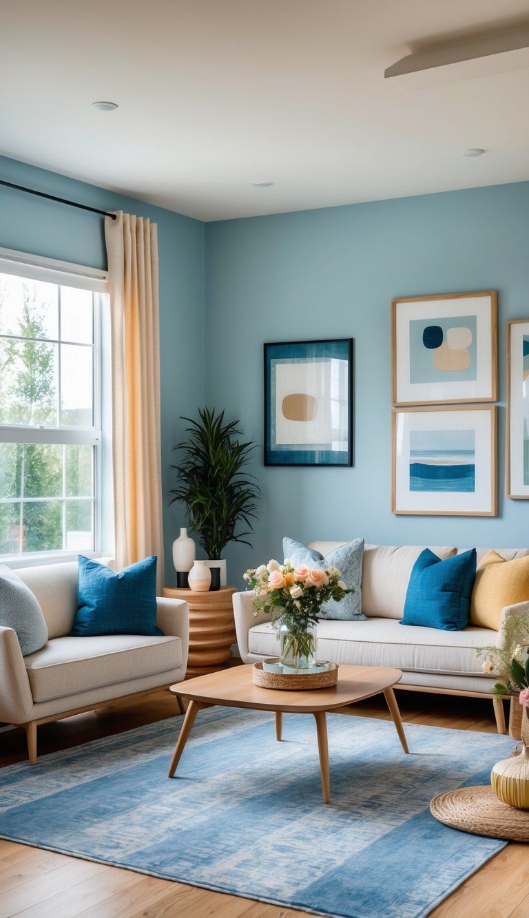
Think of your home’s color palette as chapters in a book. Every room gets its own theme, but they’re all part of the same story.
One easy way to start is by picking a main neutral color for your connecting spaces—especially if you have an open floor plan. This backdrop ties everything together, but you still have room to show off your personality in each space.
You don’t just stumble into a good color story. It usually starts with something that inspires you—a favorite painting, a cool chair, or maybe just a walk outside.
Build your palette from there, letting it flow through your home so each space feels unique but still connected. Tools like mood boards really help keep your vision on track as you figure out your colors.
Understanding Color Theory for Homes
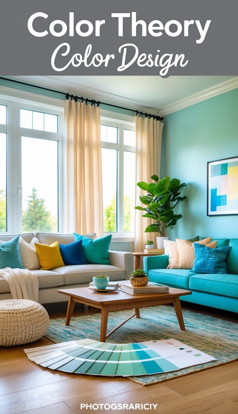
Color theory lays the groundwork for creating spaces that look good and feel right. Once you get a grip on a few basics, you can mix colors with way more confidence.
Basics of the Color Wheel
The color wheel is honestly your best friend when you’re picking out colors that play nicely together. It has primary colors (red, blue, yellow), secondary colors (green, orange, purple), and then those in-between tertiary shades.
If you use colors next to each other on the wheel (analogous), you get peaceful, harmonious vibes. Colors straight across from each other (complementary) bring drama and contrast. Blue and orange together, for example, really make a space pop.
Warm colors like red, orange, and yellow make a room feel cozy and inviting. Cool colors like blue, green, and purple set a chill, relaxed mood. This stuff really helps you set the right mood for each area.
Color Relationships:
- Complementary: Opposite on the wheel (blue/orange)
- Analogous: Next to each other (blue/green/teal)
- Triadic: Evenly spaced around the wheel (red/yellow/blue)
The 60-30-10 Formula Explained
The 60-30-10 formula makes balancing colors in any room a whole lot easier. It keeps you from overloading a space with too many competing shades.
Here’s the gist:
- 60% of your space gets the dominant color (think walls, big furniture)
- 30% is your secondary color (accent chairs, curtains)
- 10% is for your accent color (art, pillows, little accessories)
This ratio keeps things feeling balanced and helps you decide what to buy. Say your living room has neutral gray walls and a sofa (60%), blue armchairs and curtains (30%), and then red pillows and art for pops of color (10%).
The formula works for any palette and you can tweak it a bit to fit your taste. It’s a good way to avoid the chaos that comes from using too many colors in equal amounts.
Selecting a Dominant, Secondary, and Accent Color
Pick your dominant color first—it sets the tone and covers the biggest areas. Go with something you won’t get sick of fast. Neutrals like beige, gray, or soft blue tend to stand the test of time.
Your secondary color should complement the dominant one and add some interest. Use it on things like furniture, rugs, or bedding.
Now, for accents—this is your chance to go bold. Try out trendy colors here since you’re not stuck with them forever. Yellows, emerald greens, or even coral can work great as accents.
Pro tip: Look around at the stuff you already love. A painting or a cool fabric can inspire your whole palette. Always test paint or fabric swatches first—colors can look totally different depending on the light.
Building a Cohesive Color Palette
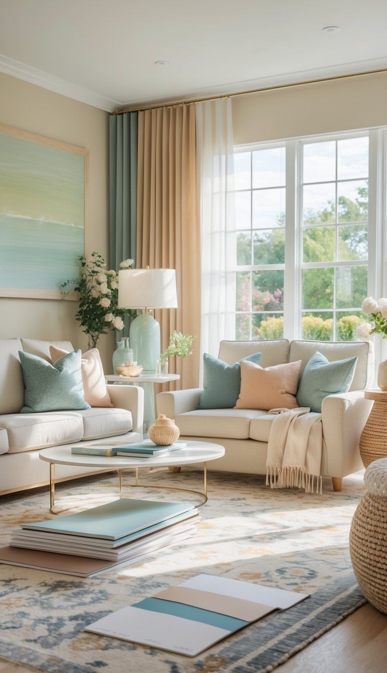
When you create a color palette that flows from room to room, your home instantly feels more put together. Thinking through your color choices helps connect spaces, but you can still give every room its own flavor.
Choosing Your Base Color
Start by picking a main color that shows up throughout your home. This base color acts as your neutral and keeps things visually connected.
“In homes with open floor plans, it’s best to choose one color that serves as your main neutral,” says Kelly Porter, a Washington D.C. interior designer.
Here are a few solid options for base colors:
- Soft whites (creamy ivory, warm off-white)
- Gentle grays (light silver, mid-tone greige)
- Muted beiges (light sand, deeper taupe)
Always test your color in different rooms and at different times of day. Paint small swatches and check how they look as the light changes.
Layering Accent Colors and Tones
After you’ve got your base, add in two or three accent colors that play well with it. Use these shades all over your home, but mix up how much you use in each space.
Your accent colors could be:
- A soft, muted shade (dusty blue, sage green)
- Something warmer (terracotta, mustard, blush)
- A neutral accent (charcoal, navy, brown)
Spread these colors around with:
- Wall paint in smaller rooms
- Furniture
- Rugs, curtains, pillows
- Art and small decor
Stick with the 60-30-10 rule: base color for 60%, primary accent for 30%, boldest accent for 10%.
Integrating Bold Colors and Neutrals
Don’t shy away from bold colors—they can really make your color story sing if you use them right.
For bolder shades:
- Add them in small doses with throw pillows, art, or accessories
- Repeat the same bold color in a few different rooms so it feels intentional
- Pair them with your neutral base to keep things from getting too loud
Nature-inspired palettes almost always work. Look outside for ideas—blues from water, greens from leaves, warm sunset tones.
Metals count as part of your palette too. If you stick with one metal finish (brass, silver, black) throughout, you add another layer of cohesion.
Establishing Visual Continuity and Flow
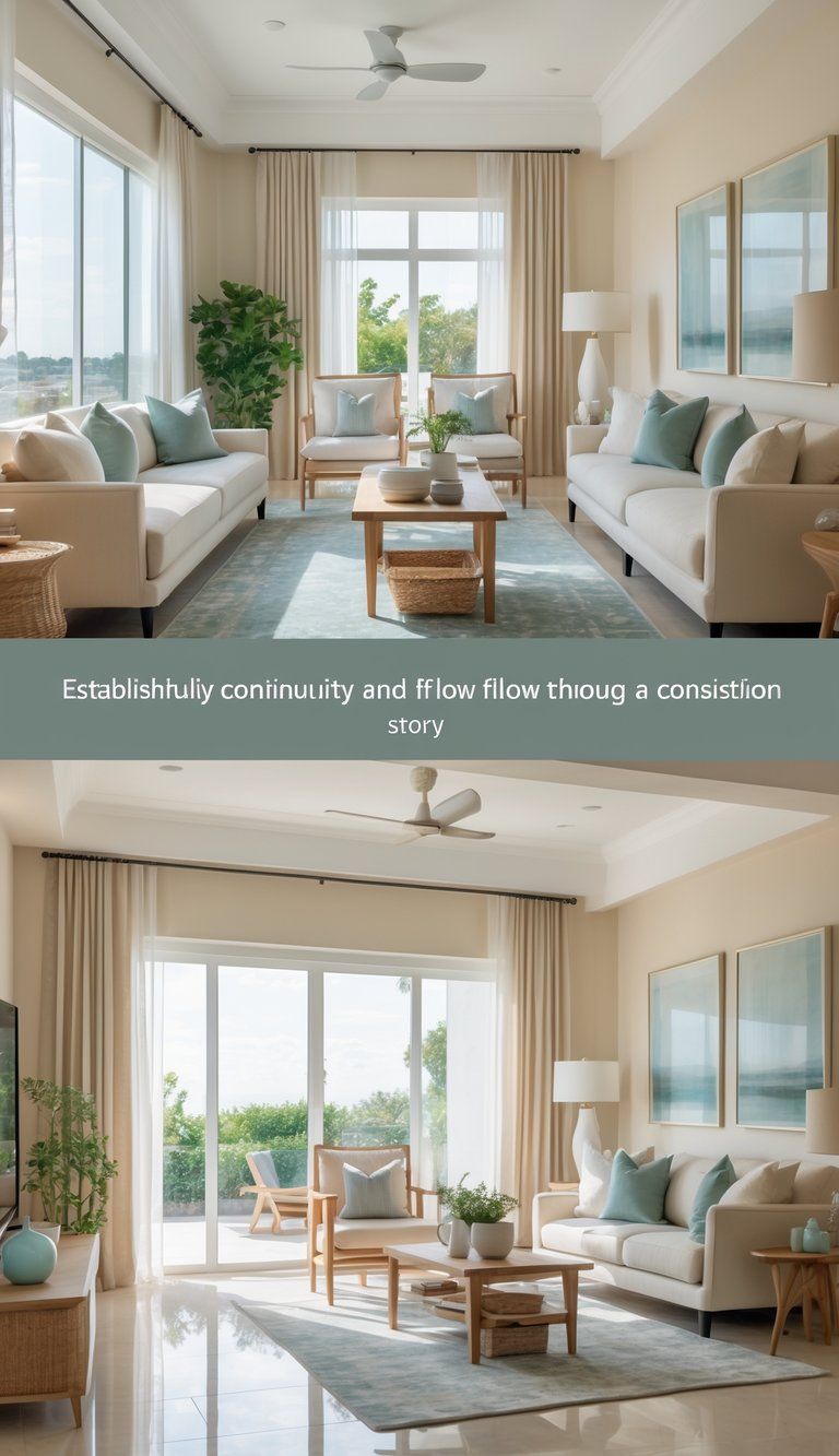
When your home has visual continuity, all the spaces feel connected, but each room still gets to have its own personality. If colors flow naturally from one area to the next, the whole place feels more cohesive and thoughtfully put together.
Ensuring Continuity Throughout Rooms
Pick a main neutral color you can use throughout your home. This anchor shade lays the groundwork and ties everything together. You don’t have to use the exact same color everywhere—shifting the tone a bit works, too.
Repeat your key colors in different ways from room to room. If navy blue is in your palette, it could show up as:
- A sofa in the living room
- Pillows in the bedroom
- Artwork in the hallway
- A rug in the dining area
Repeating colors like this creates “color echoes” that help your eye travel smoothly from space to space.
Try using the same trim color throughout. White or cream trim gives a clean break between wall colors and helps everything feel more unified.
Color Flow in Open Floor Plans
Open floor plans can be tricky since there aren’t walls to break up color changes. You need your colors to work together even more.
Pick one paint color to flow through your main areas. This neutral backdrop keeps things cohesive, but you can still add pops of personality in each zone.
Define areas with:
- Shifts in color intensity: Stick to the same color family, but play with how saturated it is
- Matching furnishings: Bring in pieces that tie together the colors from different spaces
- Unifying touches: Rugs, light fixtures, and hardware in similar finishes
Natural elements like hardwood floors can warm up cooler wall colors, giving the space a balanced, polished feel.
Harnessing Sightlines for Seamless Transitions
Pay attention to what you can see from each spot in your home. If you’re standing in the entryway, which rooms are in view? Make sure those sightlines feature colors that work together.
Connect rooms you can see at the same time by repeating accent colors. If your dining room is visible from the kitchen, bring a kitchen accent color into the dining room’s decor.
Use doorways as little transition moments. The view through each one should feel connected, not jarring.
Try a subtle color gradient as you move through your home—maybe walls go from light gray to slate blue to navy as you head deeper inside.
Always check your colors at different times of day. Natural light can totally change how a color looks, so make sure your flow works morning, noon, and night.
Selecting Paint Colors with Confidence

Picking paint colors can feel overwhelming, but it doesn’t have to be. With a good plan, you can choose shades that flow through your home and still show off your style.
Exploring Paint Strips and Swatches
Paint strips are a lifesaver when you’re planning a whole-home scheme. They show one color in several shades, from light to dark, so you can see how the tones relate.
When you spot a color you like, don’t trust how it looks in the store. Grab a bunch of paint swatches or small sample pots. Paint them on foam boards and move them around your rooms.
Watch how the color shifts as the light changes during the day. Morning sun and evening shadows can make a huge difference. Hold the samples up next to your furniture and floors to see if they play well together.
Try to stick to three or four colors for your whole home. This keeps things unified but not boring. Starting with a flexible neutral (like cream or white) as your base is always a safe bet.
Working with Paint Brands Like Sherwin Williams
Brands like Sherwin Williams make it a lot easier to pick colors. Their collections are grouped by theme, so it’s simpler to find shades that match.
Most paint brands offer online tools where you upload a photo of your room and “paint” the walls virtually. It’s not perfect, but it helps you get a feel for things.
Think about the finish, not just the color. Sherwin Williams has options from flat to high-gloss—flat hides wall flaws but isn’t easy to clean, while semi-gloss is good for busy areas.
If you’re stuck, ask for help. The staff at paint stores usually know their stuff and can suggest shades that work with your furniture and the vibe you want.
Coordinating Furniture and Accessories
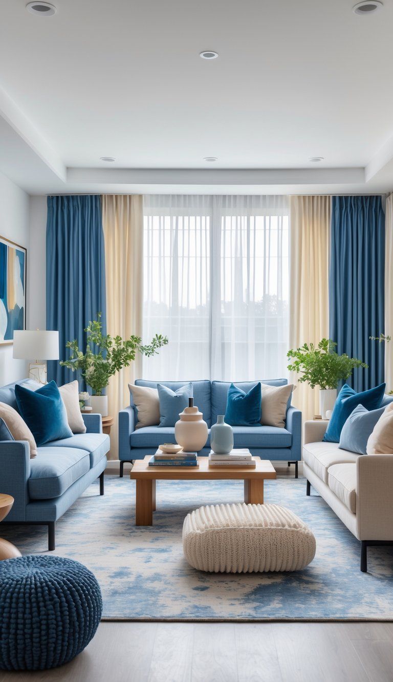
Once you’ve got your color story figured out, it’s time to bring it to life with furniture and accessories. These are the pieces that really reinforce your palette and add depth and personality to each room.
Choosing Furniture That Complements Your Color Story
When you pick out furniture, think of these pieces as the backbone of your color scheme. Big items like sofas and tables usually look best in neutral tones that work with your main colors.
This gives you a flexible backdrop that won’t clash with your accent shades.
Try to choose wood finishes with similar undertones. Oak and maple bring warm vibes, while walnut and ebony feel a bit cooler.
It’s a good idea to match these undertones with your overall color plan.
Don’t shy away from adding a statement piece in one of your accent colors. Maybe a blue velvet armchair or a rust-colored ottoman—either could become a focal point and reinforce your palette.
Tip: Snap a few photos of your paint colors before you go furniture shopping. It’ll help you see if your picks really work with your walls.
Selecting Accessories for a Finished Look
Accessories are a great way to sprinkle your accent colors all over your home. Vases, artwork, and little decorative touches can bring your color story into every nook.
Group accessories in odd numbers, like three or five, and mix up their heights. It keeps things interesting and highlights your colors.
Quick color distribution guide:
- 60% of the room: Your primary/base color
- 30% of the room: Secondary colors
- 10% of the room: Accent colors
Photos and artwork give you a chance to reinforce your palette. Pick pieces that echo your chosen colors to help everything feel connected.
It’s easy to swap out small decorative items with the seasons, so you can highlight different colors as the year goes on.
Using Textiles to Tie Colors Together
Textiles work wonders for pulling your home’s colors together. Pillows, throws, rugs, and curtains can help keep things cohesive from one room to the next.
Layer different textures within your palette to add depth. Maybe toss a chunky knit throw in your accent color next to some smooth silk pillows for a bit of contrast.
Area rugs especially can anchor your color story in each space. Look for rugs that weave in several colors from your palette to naturally connect your furniture.
Here are some ideas for where to use textiles:
- Pillows and throws on sofas and beds
- Window treatments that play nicely with your wall colors
- Table runners and placemats in dining spaces
- Bath towels and shower curtains in bathrooms
If you pick out textiles that fit your color story, you’ll create a thread that visually ties your rooms together.
Integrating Color Into Interior Design Plans
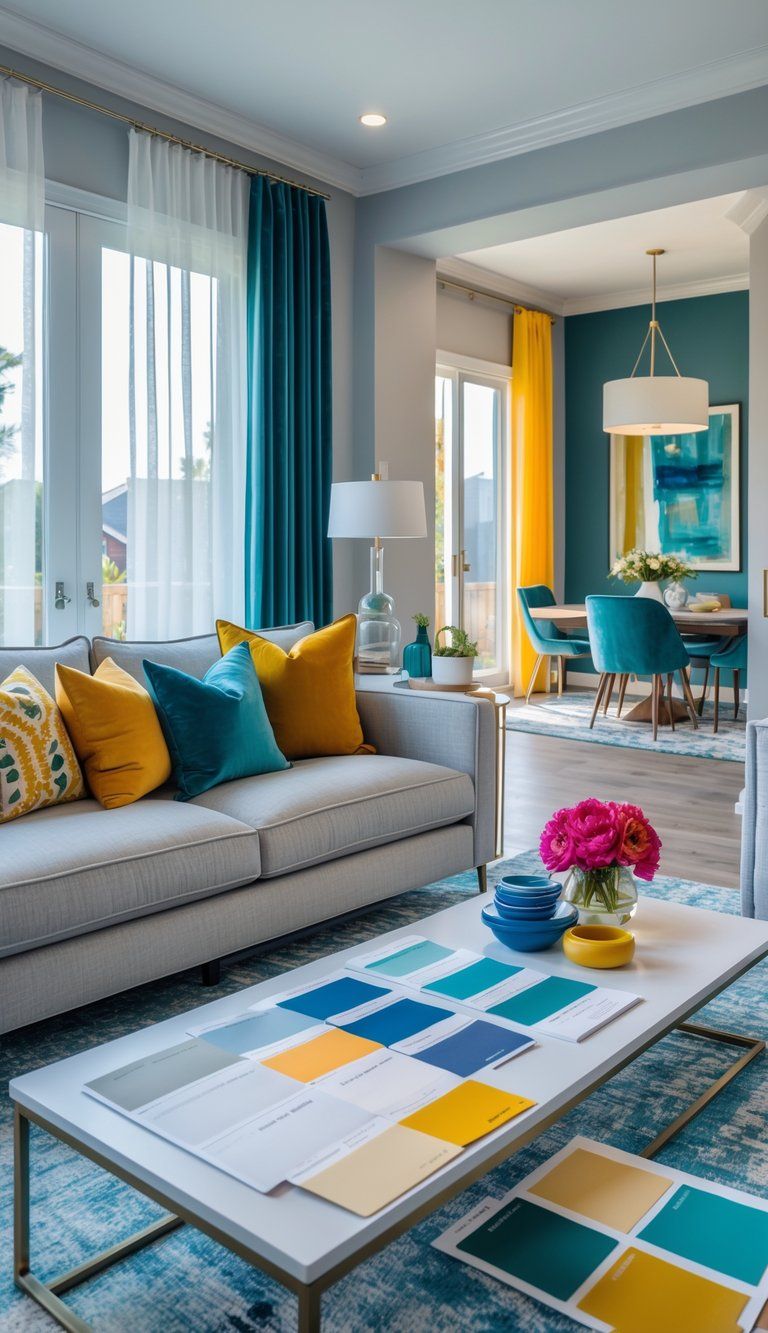
A thoughtful color plan connects your spaces while still respecting what each room is for. Good color integration starts with your floor plan and builds up from there.
Creating a Color-Supported Floor Plan
Your floor plan guides your color choices. Open concept homes especially need careful color planning to keep spaces flowing together.
Start by spotting the transition points between rooms. These are great places to shift your color story just a bit.
Try using a neutral base color in connecting areas, then add accent colors in each room.
Color mapping tips:
- Stick with the same trim color everywhere for a unified look
- Put color samples right on your floor plan
- Notice where natural light hits—colors can look totally different depending on the light
- Mark spots you can see from more than one room so your colors stay coordinated
If your rooms flow together, use different shades of the same color to carve out zones without making things feel choppy.
Designing for Modern Homes
Modern homes usually have open layouts, so you need to think carefully about how you use color. The trend for 2025? Creating “color zones” instead of just picking colors room by room.
Modern color strategies:
- Use color blocking to define areas, even without walls
- Bring color in through furniture and accessories for more flexibility
- Repeat two or three statement colors throughout your home
- Let your bold colors pop, but balance them with neutral spaces so things don’t get overwhelming
Lighting can totally change how your colors look. Test your colors under different lighting—modern LEDs, for example, can make a huge difference.
If you have smart home lighting, you can even program it to shift the mood of your space throughout the day. Pretty cool, right?
When to Consult an Interior Designer
Sometimes, bringing in a pro just makes sense. Designers know color theory and can save you from expensive mistakes.
Think about hiring a designer if:
- You’re trying to coordinate colors across several floors
- You can’t figure out how to match your old furniture with new color ideas
- Your home has tricky architectural features that complicate color choices
- You’re color blind or just can’t picture how it’ll all look in the end
Most designers offer color consultations starting around $150–$300 an hour. It’s way less than full design services, but you still get solid advice.
A good designer will hand you a detailed color plan, complete with paint codes, fabric samples, and clear steps so you (or your contractor) know exactly what to do next.
Final Touches for a Cohesive Home
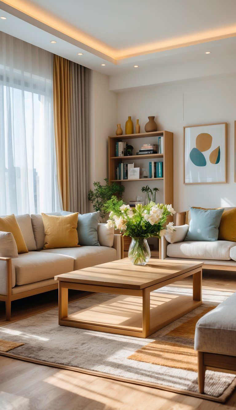
When you add those last little elements, your home finally feels like it all fits together. These finishing touches really make your color story come alive, and the space feels personal—like you actually live there.
A mood board is honestly a lifesaver. You can grab fabric swatches, paint chips, and any images that spark ideas.
This visual guide keeps your vision in check as you pick out pieces or change your mind (which, let’s be real, happens).
Throw pillows? They’re such an easy way to keep your color palette going. Just pick out pillows that show off the key colors from different rooms and you’ll notice how the spaces start to feel related.
Try adding a few simple things to boost that sense of cohesion:
- Small accessories in your accent colors
- Picture frames that work with your palette
- Plants for a little natural touch
- Books with covers that fit your color scheme
Artwork does a lot to connect spaces. If you pick pieces with your palette in mind, you’ll see the visual flow get stronger from room to room.
Lighting fixtures give you another shot at tying things together. Go for similar finishes—maybe brass or matte black—and you’ll spot a subtle thread running through the place.
And don’t sleep on textiles. Blankets, rugs, and curtains in colors that play nicely together help rooms feel connected, even if their main colors are totally different.
Oh, and empty space? It matters. You don’t have to fill every surface—sometimes the most pulled-together look comes from leaving a few things out.

