
Picking out colors for your home’s exterior can totally change its vibe. The right palette does more than just boost looks—it sets a welcoming tone and might even bump up your property’s value.
Remember to repin your favorite images!
The exterior paint colors you choose should work with your home’s style, fit in with the neighborhood, and show off your personality.

A lot of homeowners feel overwhelmed by all the color options. Honestly, it’s a big choice—you’ll see it every day for years.
You might hesitate, worrying about going too bold or playing it too safe. But, tried-and-true combos exist for all kinds of home styles.
Start with the permanent stuff on your house—think roof, stone, or brick. These features naturally guide your color choices.
Contrasting trim colors can make your home’s details pop. People still love soft whites, versatile grays, and muted yellows because they’re classic and don’t go out of style quickly.
Understanding the Importance of Exterior Paint Colors

Your home’s exterior paint colors shape the first impression for anyone who passes by. They set the mood and really influence how others see your place.
Defining Curb Appeal
Curb appeal is basically how good your home looks from the street. Paint colors play a huge role here.
Pick the right shades and you can show off your home’s best features.
Think of paint color as a handshake—it welcomes people before you even open the door.
A fresh, coordinated color scheme tells everyone you care about your home and take pride in it.
Let your home’s style point you toward colors. Victorian homes look great with detailed, contrasting trim. Modern houses usually shine with simple, clean palettes.
Colonials? They’re usually white or cream, with black shutters.
Location and weather count too. Coastal homes often go for blues and greens, while desert houses lean into earth tones that fit the landscape.
Impact of Color on Property Value
The right exterior paint colors can actually boost your home’s value by about 5-10%. That’s a pretty smart investment before selling.
Neutral colors like whites, grays, and soft blues tend to attract more buyers. Real estate pros say homes in these colors often sell faster and for more money than the oddball shades.
Check out your neighborhood before you choose. You want your home to stand out, but not clash. If you pick something way off from the rest, it could hurt your value.
Paint quality matters, not just color. Good paint holds up against fading, cracking, and peeling. That keeps your home looking sharp and protects your investment.
How Exterior Paint Influences Perception
Colors spark emotional responses. Warm shades like reds and yellows feel inviting and energetic. Cool colors—think blues and greens—give off a peaceful vibe.
The front door deserves special attention. A bold door color can make your home memorable.
Popular picks for doors include:
- Red: Welcoming and energetic
- Blue: Calm and trustworthy
- Yellow: Cheerful and optimistic
- Black: Sophisticated and classic
Mixing and matching colors for trim and accents helps highlight your home’s best details.
Monochromatic schemes—using slightly different shades of one color—create a subtle, elegant look.
Lighting changes everything. Always test paint samples at different times of day. A color that looks perfect at noon might seem totally different at sunset.
Assessing Your Home’s Exterior Features

Before you pick paint colors, take a good look at what you’re working with. Your home’s existing features set the stage for your color choices and help you avoid clashing with permanent elements.
Identifying Siding, Brick, and Shingles
Figure out your home’s main exterior materials. Each surface takes paint differently and needs its own kind of prep.
-
Siding: Wood, vinyl, fiber cement, and aluminum all need specific paint. Check their condition—fix any damage first.
-
Brick: Decide whether to paint brick (it’s permanent) or work with its natural color. If you leave brick unpainted, use trim and accents to complement its tones.
-
Shingles: Cedar shakes or decorative shingles can be painted to blend in or stand out.
Snap photos of these materials at different times of day. Light can really change how colors look on various textures.
Reviewing Roofing and Architectural Details
Your roof covers a lot of visual space, so it should guide your paint choices. Most people don’t change their roofs often, so work with what you’ve got.
Roof tips:
- Dark roofs usually pair nicely with lighter siding.
- Gray or black roofs go with almost any color scheme.
- Brown or tan roofs often look best with warmer exterior colors.
Focus on details like columns, window trim, porch railings, and decorative moldings.
Paint these in contrasting shades to show off your home’s character. For craftsman-style homes, try three colors—one for siding, one for trim, another for accents.
Evaluating Existing Landscaping
Your yard matters more than you might think. Permanent landscaping features should influence your paint picks.
Natural surroundings: Homes in the woods often look great with earth tones. Coastal houses might go for blues and grays.
Hardscaping: Stone walls, paths, and patios have their own colors. Bring samples when you choose paint.
Year-round plantings: Evergreen trees, old shrubs, and perennials create a backdrop. Pick colors that look good with these plants in every season.
Watch how sun and shade change the look of your house throughout the day and year. This helps you decide if cooler or warmer tones will look better.
Choosing a Color Scheme That Complements Your Home

Finding the right exterior paint colors isn’t just about picking what you like. Your home’s architecture, landscape, and neighborhood all play a part in creating a look that truly boosts curb appeal.
Coordinating With Architectural Style
Your home’s style gives you a starting point for color. Different styles have traditional color palettes that bring out their best features.
- Victorian homes: Bold, multi-color schemes highlight details.
- Craftsman bungalows: Earthy tones like olive, rust, and brown work best.
- Colonial homes: Usually white or cream with black or dark green shutters.
- Modern homes: Clean neutrals with a bold accent.
Check out your home’s fixed features—stone, brick, roof. Let these colors guide your choices.
For example, a gray stone foundation pairs well with paint that has cool undertones.
Selecting Monochromatic, Analogous, or Contrasting Palettes
You can use color theory to pick a color scheme:
Monochromatic: Different shades of the same color. This looks subtle and elegant, especially on traditional homes.
Try a light gray body, darker gray trim, and matching doors.
Analogous: Colors next to each other on the color wheel. This adds harmony and interest.
Blue-green siding, blue trim, and green accents can look fantastic.
Contrasting: Colors from opposite sides of the wheel. This makes a bold statement.
Think navy blue with white trim and a red door.
A good rule of thumb: 60% main color, 30% secondary (trim), and 10% accent (doors, shutters).
Factoring in Landscaping and Greenery
Your home sits in a landscape, not a vacuum.
Consider the colors of trees, plants, and what your yard looks like in every season.
Fixed elements like driveways, walkways, and garden structures matter too.
If your house is surrounded by greenery, warm neutrals like taupe or soft yellow can really pop.
Desert landscapes usually look great with terracotta or sand tones.
Take photos at different times of day and see how the light changes everything. Morning light is cooler; evening light is warm and golden.
Considering Trends and Timeless Selections
Paint trends come and go, but repainting isn’t cheap or quick. It’s smart to balance what’s popular with what will last.
Current trends:
- Warm whites and creams with black accents
- Moody blues and greens for the body
- Bold front doors in yellow or red
Timeless picks:
- Classic white with black or navy trim
- Soft grays with white trim
- Earthy neutrals like taupe or sage green
Colors always look brighter and more intense on big surfaces than on small paint chips. Most people end up happier if they go a shade lighter than they first thought.
Try out samples on boards and move them around your home’s exterior before you decide.
Evaluating Paint Products and Brands

Picking the right paint product matters just as much as the color itself. Good paint gives you better coverage, lasts longer, and can save you money in the long run.
Selecting High-Quality Exterior Paint
Look for paints made for exteriors. These contain special additives to handle tough weather, UV rays, and temperature swings.
Check the solid content—aim for 35-40% or higher for better coverage and durability. You can usually find this info on the label or data sheet.
Price sometimes signals quality, but not always. Paints in the $30-60 per gallon range often hit the sweet spot for quality and value.
Some paints come with built-in primers. These can save time and cut down on coats, especially if you’re painting over old paint.
Reviewing Popular Brands Like Benjamin Moore
Benjamin Moore gets high marks for exterior paint. Their Aura and Regal Select lines cover well and last, though they’re not cheap ($50-80 per gallon).
Sherwin-Williams offers solid options like Duration and SuperPaint, both known for resisting moisture and holding color.
Behr Premium Plus Ultra (from Home Depot) is a good pick if you want something more affordable but still durable.
PPG and Valspar have also become popular for their weather-resistant formulas and wide color choices.
Before you buy, check out customer reviews and Consumer Reports. Real feedback from people who’ve lived with the paint can tell you a lot.
Understanding Product Longevity and Finish
Most quality exterior paints last about 7 to 10 years. If you go for premium products and keep up with maintenance, you might stretch that to 15 years.
The finish you pick changes how your house looks and how the paint performs.
- Flat/Matte: This finish hides imperfections, though it’s not very washable.
- Eggshell/Satin: Offers a good mix of durability and appearance.
- Semi-gloss: You’ll find it more washable and moisture-resistant.
- Gloss: Super durable, but it definitely highlights any flaws in the surface.
Think about your local climate before you pick a finish. In humid places, you’ll want mildew-resistant paint. If you live somewhere with wild temperature swings, go for paint with more elasticity so it won’t crack as easily.
Check the temperature range printed on the paint can. Usually, you’ll need temps between 50-90°F for the paint to cure properly. If you paint outside that window, you risk adhesion issues and peeling way too soon.
Color Selection Strategies for Maximizing Curb Appeal

Picking the right exterior paint colors can really boost your home’s curb appeal. It’s not always easy, but analyzing what works, understanding color theory, and playing with accent colors can help you pull off a look that feels put together.
Leveraging Data and Analytics
Some colors just sell homes faster—there’s research to back that up. Studies say blue or gray exteriors often get better prices.
Take a walk around your neighborhood and snap photos of homes that catch your eye. Figure out which color combos you keep coming back to. You’ll end up with your own mini data set to guide your choice.
Try out color visualization tools from big paint brands. Upload a photo of your house and see what different colors look like before you commit.
Don’t ignore climate. In hot places, lighter colors reflect heat and might cut cooling costs by up to 40%. Cooler climates? Darker colors absorb heat and keep things cozier.
Choosing the Right Shade and Undertone
Every paint color hides an undertone that changes in different lighting. Cool grays lean blue or green, while warm grays have brown or beige vibes.
Always test first. Paint big sample boards—at least 2 feet square—and check them out at different times of day. The same color can look totally different from morning to night.
Look at your home’s permanent features:
- Roof color and material
- Brick or stone accents
- Landscaping
- Neighboring houses
Pick a shade that works with those elements. Gray looks great with cool landscaping, and warm beige or tan really pops against red brick.
Using Accent Colors for Window Boxes and Doors
Your front door is the perfect spot for a bold color. People love:
- Deep navy blue
- Rich red
- Bright yellow
- Forest green
Use accent colors on window boxes or shutters, but try to keep them in the same color family for a pulled-together feel.
For a classic look, stick with three colors: main exterior, trim, and an accent for doors or window boxes.
Bold accents really shine against a neutral house. That mustard yellow door? It’ll add personality to a gray home without going overboard.
Considering Environmental and Lighting Factors

Your paint color will shift all day long because of the environment and lighting. These natural elements can really mess with your expectations.
Effect of Natural Light on Paint Colors
Exterior colors can look totally different outside than they did in the store. Morning light adds a yellow warmth, while afternoon sun can wash colors out or make them seem brighter. By evening, you might see blue-purple undertones appear.
Test paint samples at different times of day. Put them on a few sides of the house—direct sun, partial shade, and full shade all matter.
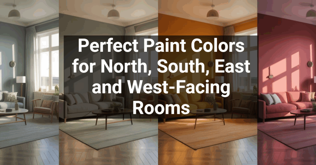
North-facing walls get cooler, indirect light, which can make colors seem darker or muted. South-facing walls soak up sunlight, making colors pop.
Cloudy and sunny days also change things. That perfect shade in bright sun might look dull when it’s overcast.
Adapting to Regional Climate
Your local climate should guide your color picks. In hot, sunny places, lighter colors reflect heat and may drop cooling costs by as much as 30%.
Dark colors absorb heat, which can be a blessing in cold climates but a headache in hot ones. They tend to fade faster under strong sun and can even warp siding.
Think about your weather:
- Coastal areas: Salt air fades paint, so marine-grade options are worth it.
- Rainy places: Go for mildew-resistant paint to keep your walls looking clean.
- High-altitude spots: UV-resistant paint protects against harsh sun.
Your surroundings matter, too. Houses under big trees often look best in earthy tones, while homes out in the open can handle more daring colors.
Incorporating Dark Colors for Modern Appeal

Dark colors have become a go-to for modern homes. They can turn a plain house into something bold and memorable, especially when you add the right accents.
Balancing Dark Colors With Lighter Elements
If you go dark, balance is key. Try pairing charcoal or deep navy siding with crisp white trim. This combo creates sharp lines and keeps the look fresh.
Light-colored paths or pale gravel can brighten up the approach to a dark house.
Add natural wood—like cedar posts or a wooden front door—to warm up the look. Wood breaks up big dark areas and softens cool shades.
Lighting matters a lot with dark exteriors. Good outdoor lights can highlight details and make your home look inviting after dark.
Examples of On-Trend Dark Exteriors
Deep charcoal gray is basically a modern classic now. It works for both old and new homes and sets off colorful landscaping beautifully.
Black exteriors make a big statement if you do it right. Picture a modern farmhouse with black siding and white trim—it’s dramatic and timeless.
Navy blue has depth but isn’t as harsh as black. Pair it with brass hardware or warm wood for a look that’s bold but still welcoming.
Dark green blends well with nature, especially if your house is surrounded by trees. Forest green or deep sage adds rich color without feeling over the top.
Not ready to go all-in? Use dark colors just for accents—like the front door or shutters—to add style without committing to a full dark exterior.
Showcasing Transformations: Before and After Examples

Real-life home exterior makeovers can spark ideas and show what’s possible. These before-and-afters highlight the impact of smart color choices.
Case Studies of Enhanced Curb Appeal
Take the 1893 Victorian that lost its classic charm over the years. The owners added a wraparound porch and chose a bold exterior paint that completely changed the vibe. Fresh architectural details and strong color choices brought back its historic appeal.
Another great example is a country home with clashing colors. The owners picked Benjamin Moore Ballet White and Willow, using Sherwin Williams Determined Orange for accents. This combo showed off the house’s features and tied everything together.
Urban row homes can benefit too. One 120-year-old row house got new columns, porch details, and carefully chosen paint colors. The result respected the home’s history but gave it a fresh, updated look.
Utilizing Social Media and Advertising for Inspiration
Pinterest and Instagram? Honestly, they’re a goldmine for exterior paint ideas. You can scroll through thousands of before-and-after shots, which really helps you picture what’s possible for your own place.
A lot of paint brands run their own accounts, too. They love to show off projects where people used their products and got great results.
Home improvement TV shows also dive into exterior makeovers. They walk you through everything, from picking colors to actually putting paint on the walls.
Sometimes they’ll even chat about why certain colors just work better with some architectural styles. It’s pretty interesting if you’re into that sort of thing.
Paint companies now have these neat visualization tools on their websites. You just upload a photo of your house and try out different colors digitally.
It’s a clever way to experiment with options before you spend a dime. Why not play around a bit?
Local paint stores sometimes put up before-and-after photos from projects in your area. Seeing real homes in your climate and lighting can make a big difference when you’re choosing colors.