Pattern mixing can instantly turn a bland home into a bold one. Most people hesitate to combine prints, thinking they’ll end up with chaos instead of style.
Remember to repin your favorite images!
But mixing patterns feels a bit like making music—you’re just trying to find a good rhythm between all the different elements, letting each one stand out in its own way.
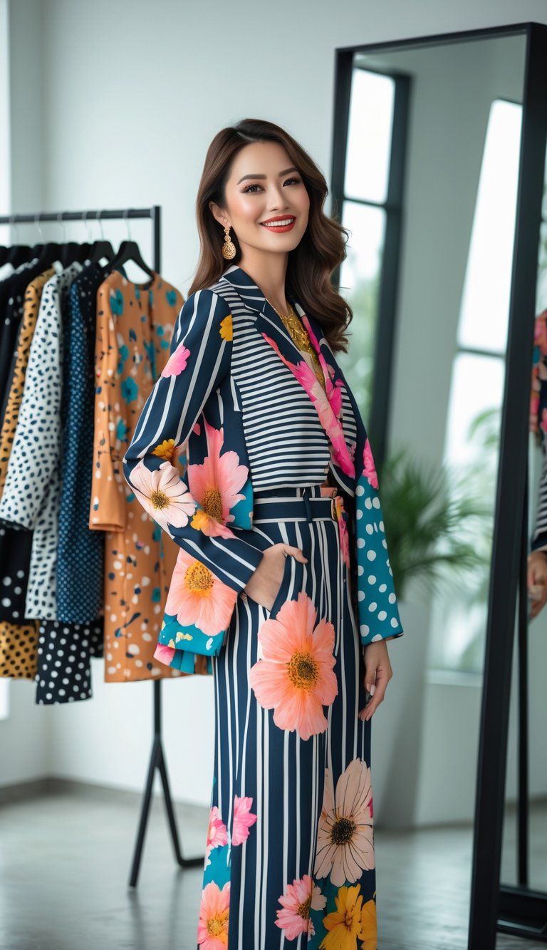
The trick to mixing patterns well is knowing how to balance scale and contrast. When you get it right, throwing together florals with stripes, geometrics with organic shapes, or bold prints with subtle textures actually adds depth and character. Suddenly, your rooms start to feel more like you.
You really don’t have to follow any rigid rules. Try starting with just two prints in colors that play nicely together. Maybe go for a big, bold pattern and then something smaller, or toss in a few solid colors so your eyes can relax a little. Even texture counts—a nubby throw or a rough vase adds another layer to your story.
Understanding Pattern Mixing

Pattern mixing changes a space from basic to interesting. If you learn the basics, you’ll start seeing how prints can make a room feel more like you.
What Is Pattern Mixing?
Pattern mixing is about bringing different prints together in one space. This technique adds visual interest and depth. Instead of sticking to one pattern per room, why not layer florals with stripes, or plaids with polka dots?
Good pattern mixing doesn’t just happen by accident. You make choices that bring energy and personality. When you nail it, mixed patterns look curated and comfortable at the same time.
You can use this technique anywhere—living rooms, bedrooms, even bathrooms. Pattern play breaks up the dullness that comes from too much matching.
Key Principles of Combining Prints
A few basic ideas make pattern mixing work:
Scale variation – Mix big, medium, and small patterns so things feel balanced. A large floral next to a tiny geometric? That works.
Color cohesion – Stick to a color palette that repeats across your prints. If they share a couple of colors, you’re golden.
Pattern diversity – Combine different pattern types:
- Organic (florals, botanicals)
- Geometric (stripes, checks)
- Global (ikat, batik, tribal)
Visual breathing room – Toss in solids or neutrals so your eyes get a break.
Try to keep it to 3-5 prints in one space. More than that, and things get wild fast.
The Role of Personal Style
Your own taste should lead the way. Maybe you like soft combos—navy stripes with pale florals. Or maybe you’re all about bold clashes like bright geometrics with animal prints.
Trust your gut. If a combo feels good to you, it probably works.
If you’re nervous, start small—throw pillows or vases before you go big with wallpaper or a couch.
Honestly, don’t stress the “rules.” Some of the coolest rooms break them anyway.
Exploring Types of Patterns
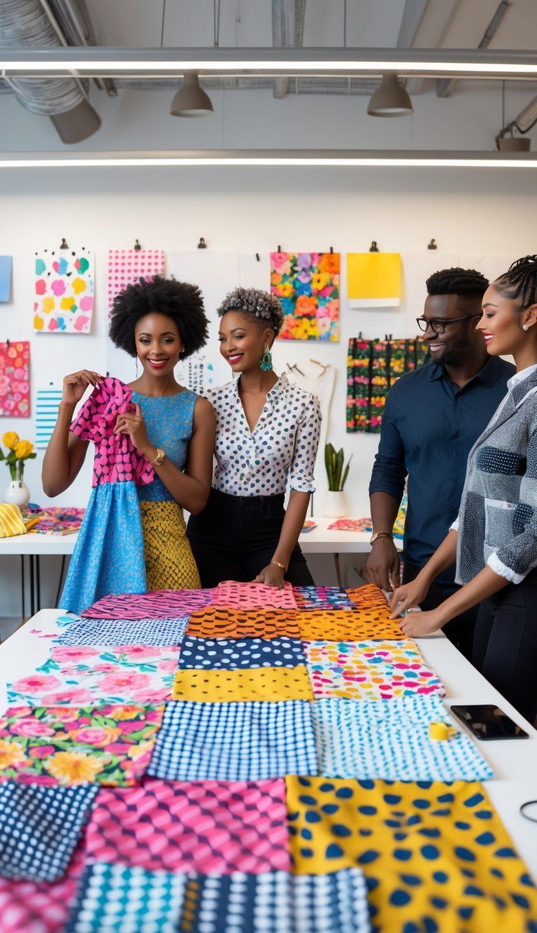
Knowing the different types of patterns makes mixing them way easier. Every pattern brings its own vibe, and that changes how they play together.
Geometric Patterns and Stripes
Geometric patterns show up as squares, triangles, circles—anything with a repeating shape. They add structure and keep things interesting.
Stripes, honestly, might be the most versatile. You get pinstripes for a hint of texture or bold stripes for a big statement. They’re a great base for pattern mixing.
Mixing geometric patterns? Change up the scale. A tiny checkered pillow next to a chunky herringbone throw just works.
Stripes almost act like neutrals. You can pair a striped shirt with a floral skirt or a plaid jacket, and it just looks intentional.
Florals and Floral Prints
Florals bring in a touch of nature and soften up a design. You’ll find everything from tiny, detailed prints to massive, splashy blooms.
Vintage florals lean small and intricate. Modern ones go big and bold. Either way, florals are super flexible for mixing.
Think about the season, too. Light florals feel fresh in spring and summer, while deeper florals suit fall and winter.
To mix florals, try pairing a big floral curtain with small floral pillows. Or mix florals with stripes for a timeless combo that feels balanced.
Animal Prints, Graphic Prints, and Polka Dots
Animal prints—leopard, zebra, snake—bring excitement and texture. Surprisingly, they often work as neutrals. A leopard pillow goes with more than you’d think.
Graphic prints are bold and abstract. They grab attention, so keep other patterns simple when you use them.
Polka dots are playful and lighthearted. You can get them in all sizes, and they look great with stripes or florals. Just stick to a matching color palette and mix up the dot sizes.
When you mix these, keep the colors tight. A black and white zebra print and black polka dots on white can totally work together.
Traditional and Bold Prints
Traditional prints—think paisley, damask, toile, ikat—carry history and stories. They’re classic, but you can make them feel new.
Bold prints are all about drama. They’re bright, loud, and grab attention. Use them as a focal point, but balance them with simpler patterns.
Give traditional prints a modern spin by pairing them with basic geometrics.
For bold prints, try the 60-30-10 rule: make your bold print 10% of the space, another pattern 30%, and keep 60% subtle or solid. That way, the bold print pops but doesn’t take over.
Mastering Scale and Proportion
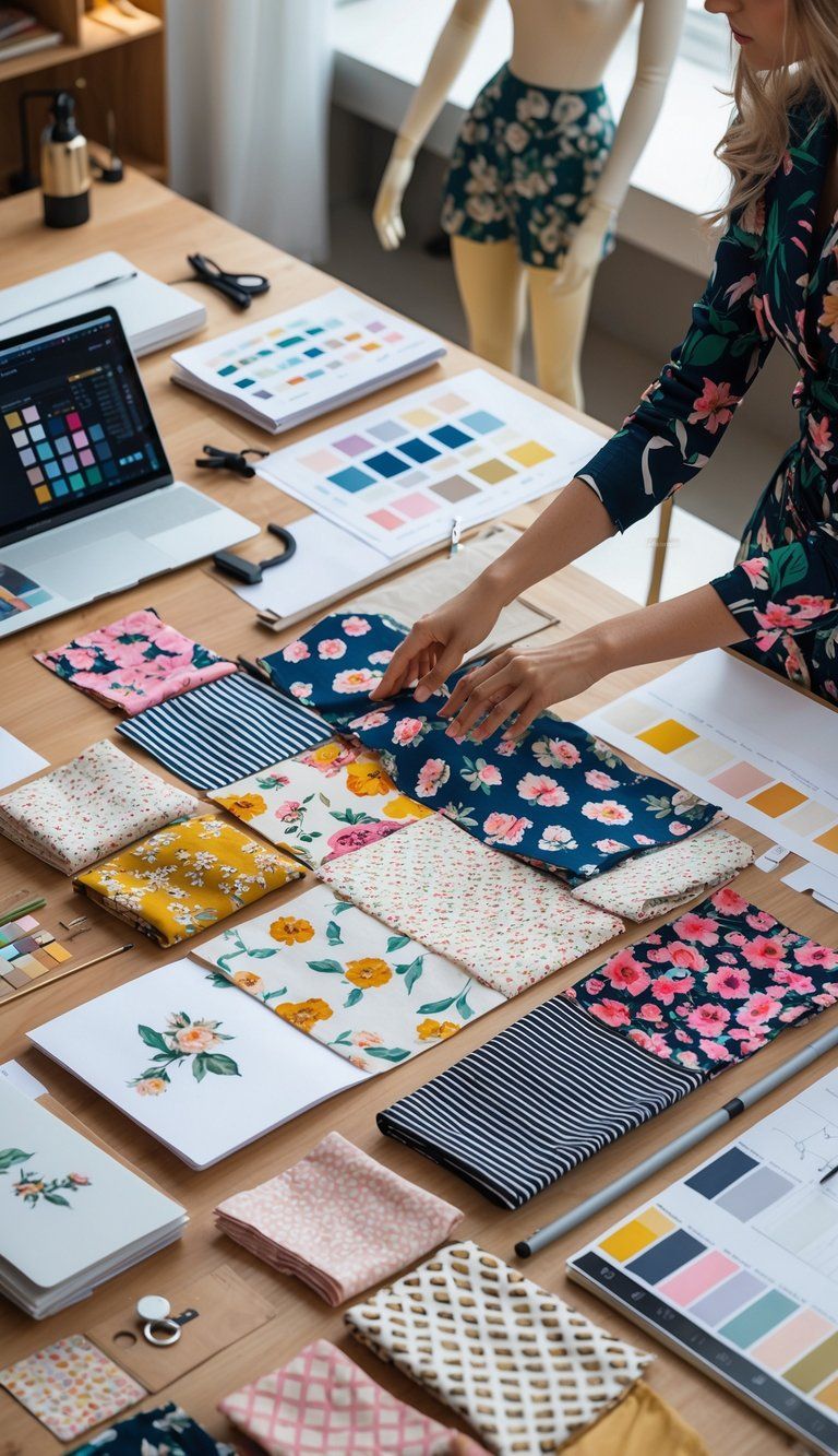
Scale and proportion are what really make pattern mixing work. Get these right, and your space feels balanced instead of busy.
Understanding Pattern Scale
Pattern scale is just the size of the design on the fabric. Patterns usually fall into three types:
- Large-scale patterns: Big florals, chunky geometrics, oversized shapes that stand out
- Medium-scale patterns: Middle-of-the-road designs that tie things together
- Small-scale patterns: Tiny dots, fine stripes, or little motifs that are more subtle
When you look at a fabric, back up a bit. Sometimes a pattern that looks wild up close just reads as texture from across the room.
Notice how pattern scale changes a space. Too many big patterns in a small room can make it feel crowded. Tiny patterns in a big room might just disappear.
Mixing Different Scales Effectively
The secret? Mix up your scales. A huge floral next to a little geometric pattern keeps things interesting without feeling like they’re fighting.
Here’s a simple plan:
- Pick one big, bold pattern as your base.
- Add a medium pattern that shares at least one color.
- Finish with a small pattern that almost acts as a texture.
The 60-30-10 rule helps here too: 60% dominant pattern, 30% secondary, 10% accent.
Lay your fabric swatches together and step back. If one grabs your attention while the others support it, you’ve got a good mix.
Color Harmony and Contrast in Pattern Mixing
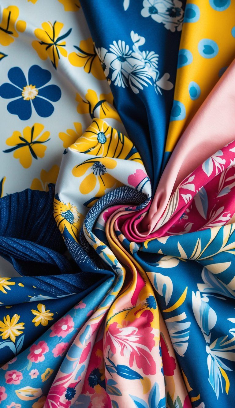
Getting the colors right is what really makes pattern mixing work. Good color relationships bring everything together, even when the prints seem totally different.
Building a Cohesive Color Palette
Start with a color palette that ties your patterns together. Pick 3-5 colors that vibe well, mixing bolds and neutrals. Keeping it limited helps everything feel connected.
You can build your palette from:
- A favorite patterned piece (just pull colors out of it)
- The color wheel (complementary or side-by-side colors)
- Seasonal inspiration (think autumn golds or spring pastels)
If the colors all have similar saturation—like all jewel tones or all pastels—they’ll mix more easily. The 60-30-10 rule works for colors too: 60% dominant, 30% secondary, 10% accent.
Contrast and Cohesion Explained
You need both contrast and cohesion. Contrast keeps things lively; cohesion stops it from looking like a circus.
Color contrast comes from:
- Opposite colors on the wheel
- Light and dark differences
- Warm and cool mixes
Cohesion happens when you repeat colors across patterns. If your floral has blue and yellow, work those into your stripes or geometrics.
Balance is everything. Too much contrast feels messy, but too much sameness gets boring. Try keeping one thing steady—like color intensity—while you mix up the pattern sizes.
Using Monochrome and Solid Colors
Monochrome schemes and solid colors give your eyes a break and make the patterns pop.
Solids work as:
- Backgrounds that let patterns shine
- Breathing room between prints
- Frames that define spaces
If you want a more subtle look, try mixing patterns in different shades of the same color. It adds texture but stays elegant.
When you go bold with patterns, throw in some solid pieces to keep things grounded. A navy sofa with patterned pillows and curtains looks put together, not overwhelming.
Incorporating Texture and Layering
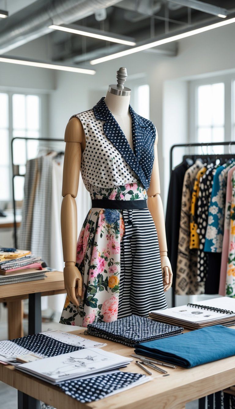
Texture makes pattern mixing feel richer and more interesting. It’s not just about prints—texture adds that extra layer so your space feels thoughtfully designed.
Texture as a Design Element
Texture brings a whole new layer to your pattern mixing game. When you mix prints, try tossing in textural elements like velvet, linen, wool, or silk for some contrast and depth.
Picture this: a smooth silk pillow with a bold print pops against a nubby tweed sofa in a matching color. That contrast really lets each piece shine and keeps things feeling harmonious.
You can use texture as a kind of neutral, too. A heavily textured solid piece calms down the busy patterns nearby. Take a chunky knit throw on a striped chair—it adds interest without fighting with the stripes.
Texture isn’t just about fabric. Think about natural materials like wood, stone, or rattan.
Metallic finishes, glass, and ceramics also bring in texture. Woven elements? Absolutely.
Techniques for Layering Patterns
Layering patterns works best when you plan your arrangement and play with scale. Pick a dominant pattern first, then add prints in different sizes to support it.
The rule of three helps: go for a large-scale pattern, something medium, and one that’s small. It’s a simple way to keep things balanced and interesting.
Maybe you use big floral curtains, medium geometric pillows, and tiny patterned accessories. That combo just works.
Stick to a consistent color palette to tie your patterns together. You could use one main color throughout, a family of related shades, or a neutral base with pops of the same accent.
Try placing patterns at different heights in the room. Put a bold rug on the floor, patterned pillows at sofa level, and subtle art up high. This guides your eye around the space without feeling chaotic.
Applying Pattern Mixing in Interior Design
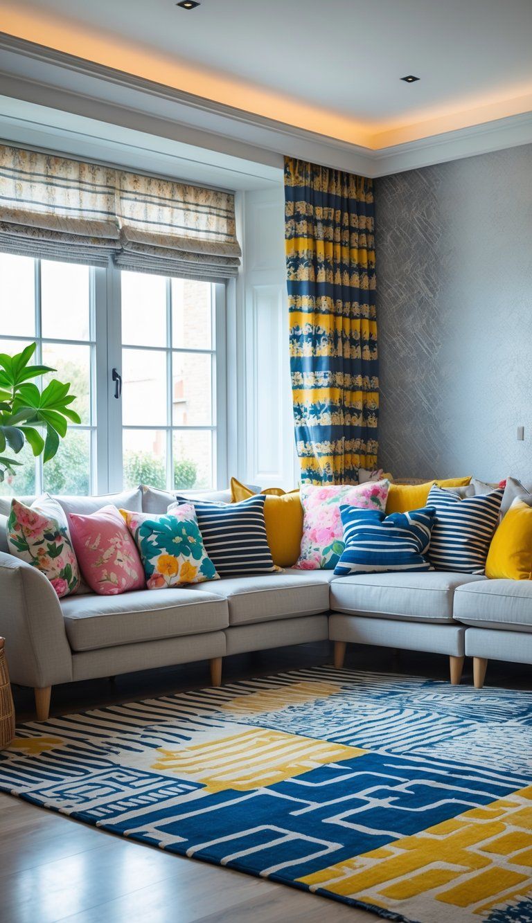
Pattern mixing in interior design adds depth and personality to any room. When you get it right, the space feels elevated and full of visual interest.
Choosing Patterns for Walls and Wallpaper
Walls set the stage for your pattern mixing. Floral wallpaper, for example, makes a strong statement in dining rooms or bedrooms.
If you’re new to this, try patterned wallpaper on just one accent wall before going all in.
Think about the scale when you pick wallpaper. Large patterns suit big rooms, while smaller prints feel cozy in tighter spaces.
If wallpaper feels intimidating, textured paint techniques can give you subtle pattern effects.
Choose a dominant pattern for your walls, then mix in complementary patterns elsewhere. The “Rule of Three” helps—stick to three different patterns in a space to keep things from getting wild.
Balance out patterned walls with solid furniture or do the reverse. This gives your eyes a break and keeps things feeling fresh.
Patterned Rugs, Upholstery, and Soft Furnishings
Soft furnishings are a fun, low-stakes way to play with pattern mixing. Start with a patterned rug as your anchor. Geometric rugs with floral upholstery? Surprisingly, they can look amazing together.
When you pick upholstery, think about how durable it is, especially if you’ve got kids or pets. Choose smaller patterns for smaller pieces, and keep colors in sync with what you already have.
Mix up your cushions—stripes, florals, and some solid throws all in the same palette. That’s an easy win.
Window treatments are another spot for patterns. Sheer curtains with a subtle design let in light and add texture. Try echoing a color from your rug in your curtains or pillows for a pulled-together look.
Using Accessories for Pattern Play
Accessories are the easiest way to dip your toes into pattern mixing. Grab some patterned throw pillows, table runners, or decorative boxes and see what you like.
Art with strong patterns can become a focal point. Pick pieces that pull together colors from around the room for instant harmony.
Other accessories that add pattern? Decorative plates, patterned lampshades, printed photo frames, and textured baskets all bring something different.
Mix up textures, too. A smooth ceramic vase with a geometric print next to a rough woven basket feels interesting and layered.
Swap out accessories with the seasons to keep your pattern mix feeling fresh all year.
Decorating a Room with Mixing Prints
Start by picking a color palette—three or four colors max. If every pattern shares at least one of those hues, you’ll keep things cohesive even if the prints themselves are wild.
Balance matters. If your sofa’s loud, choose chairs in a smaller pattern or a solid color to avoid clashing.
Think about what the room’s for. Bedrooms usually feel better with calming patterns like soft stripes or tiny florals. Living rooms can handle bolder pattern combos.
Try creating different zones in one room using unique pattern pairings. Maybe a reading nook has paisley pillows on a striped chair, while the main seating area features a totally different combo.
Don’t skip scale variety. Mix large, medium, and small prints for a look that’s dynamic and never boring.
Creating Harmony and a Common Thread
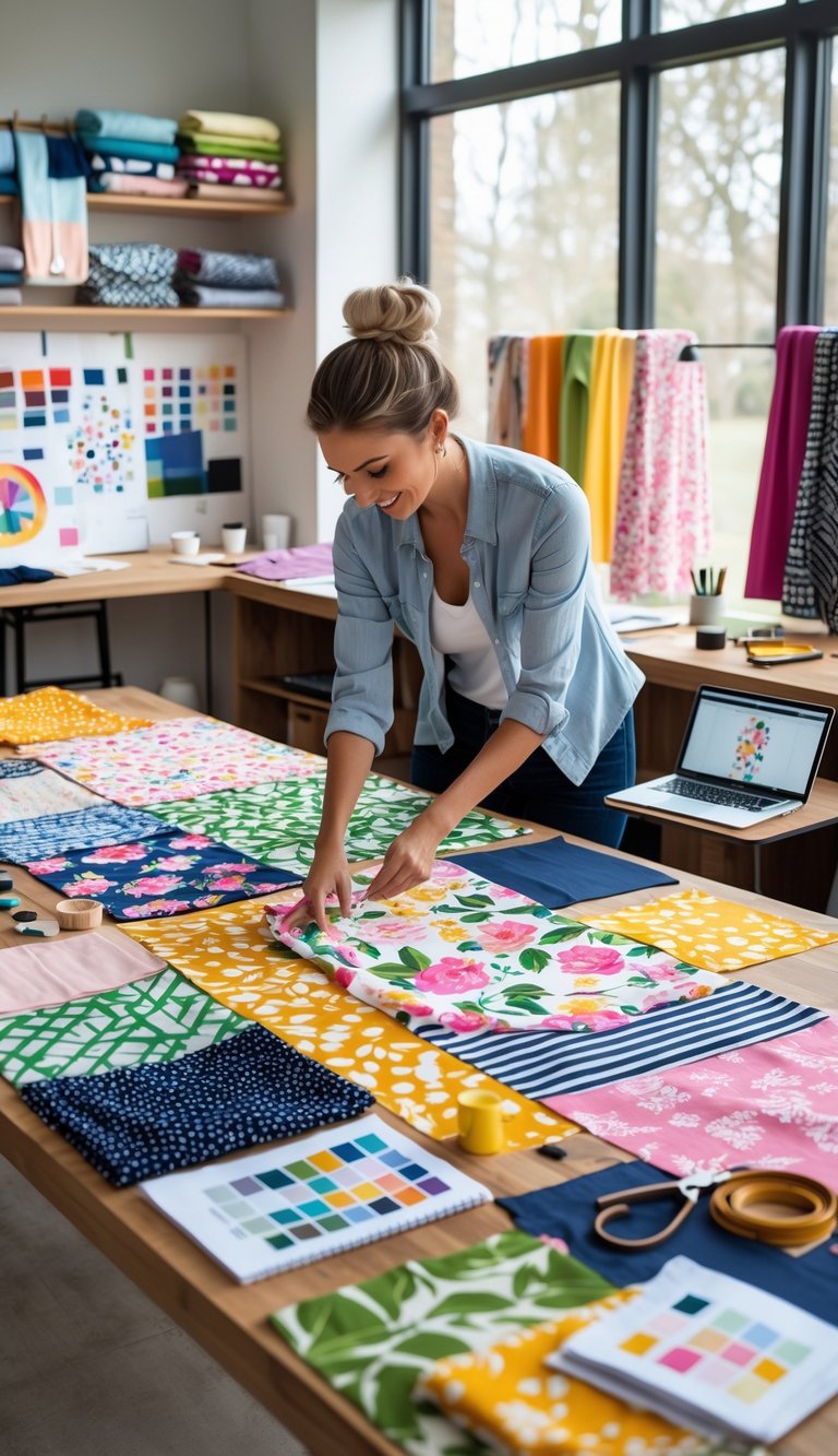
Mixing patterns is all about balance. You need a unifying element—maybe it’s color, scale, or a certain vibe—to tie everything together.
Unifying Diverse Prints and Patterns
The trick to mixing patterns like you know what you’re doing? Find a common thread. Maybe it’s a color that shows up in every pattern, or a similar style running through each one.
Color Connection: Stick with a consistent palette. A blue striped pillow can totally work with a blue-and-green floral chair if the blues match.
Style Consistency: Patterns with the same style usually blend better. Modern geometrics tend to play nicely together, while mixing modern with super traditional can get tricky.
Try this formula if you’re unsure:
- 60% dominant pattern
- 30% secondary pattern
- 10% accent pattern
Establishing Flow with Pattern Combinations
Creating flow is all about arranging patterns so your eye just glides through the space. Try not to crowd all the bold patterns into one spot.
Scale Variation: Mix up large, medium, and small-scale patterns. For example, a big floral print feels right alongside tiny polka dots—they don’t fight for attention.
Distribution: Spread patterns around the room. Got patterned curtains on one side? Add a pattern with similar intensity somewhere across the room to keep things balanced.
Texture as Pattern: Don’t forget, texture totally counts as a pattern. A solid velvet sofa can add some visual interest, especially if you toss on a few patterned pillows.
Use neutral spaces between bold patterns so your eyes get a break. This little trick keeps the room from feeling chaotic or just plain too much.

